I am so pleased.
I've written a lot of content recently about the new MacBook: first positing that it would be a capable machine, then finding that it was indeed a mostly capable machine, and most recently discovering that at times, Windows 10 made it feel like an even more capable machine. I think that the most important observation I made is how the 2015 MacBook is surprisingly agile, but how the user interface transitions in OS X hold it back from feeling completely agile. There was a surprisingly large response to my recent article about running Windows 10 on the new MacBook. I think it resonated with people because it pointed out something that Mac users have felt for a while now: OS X Yosemite just isn’t as smooth as it should be.
As I hoped, Apple announced OS X El Capitan at WWDC 2015, a sort of “Snow Yosemite” release that focuses on user experience and performance. User experience and performance. That’s just what I wanted to hear.
I’ve wasted no time at all getting El Capitan Developer Preview 1 running on the 2015 MacBook. Just like Windows 10, it should be stated right away that this is a beta, and performance may not actually be indicative of the final product. But I’ve been trying out OS X betas for a few years now, and on the whole they’re stable and worthwhile. Especially because this is more of a “tweaking” release, it’s not unfair to expect the experience to be relatively polished at this stage.
Installation of El Capitan was just as you’d imagine. I mounted the DMG and installed it in about 30 minutes total. There is a new installation screen that tries to imitate the boot screen by just showing the Apple logo and a loading bar, but it was otherwise business as usual.
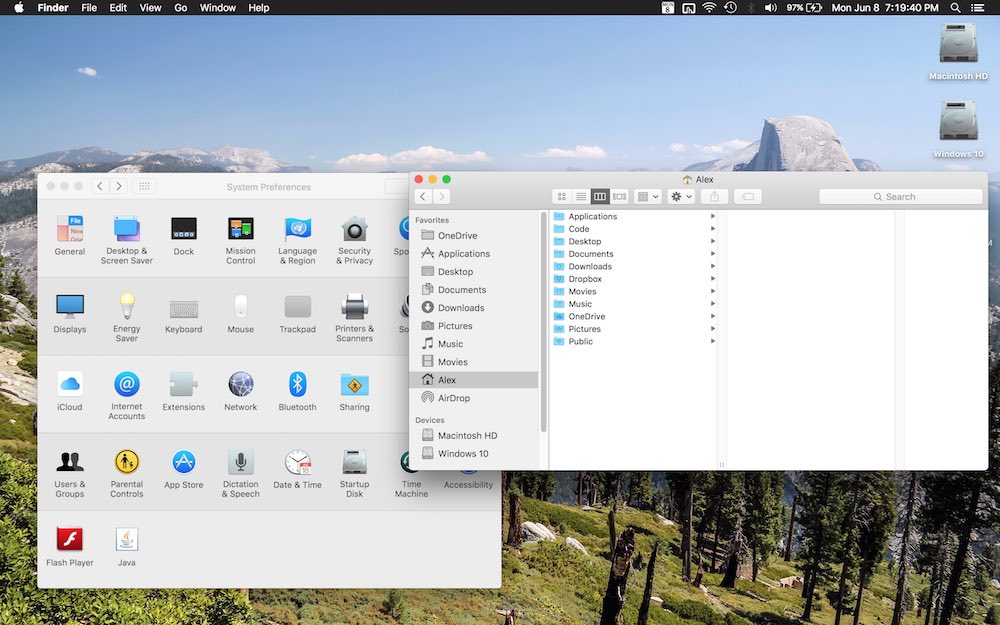
Yosemite already revamped the look and feel of OS X, and El Capitan doesn’t do much in terms of design to shake it up. Small changes are here, such as a more frosted pane behind desktops in Mission Control. I was initially worried that the rumored switch to San Francisco for OS X and iOS would seem too forced. That, and I really do like Helvetica. But I have to say, within seconds of reaching my desktop, I appreciated the subtle change that San Francisco provides. It gives a bit of a fresh feel to things, and it's very legible by design. I'm a fan of this change. There's also a new, flatter spinning beachball that looks cool.
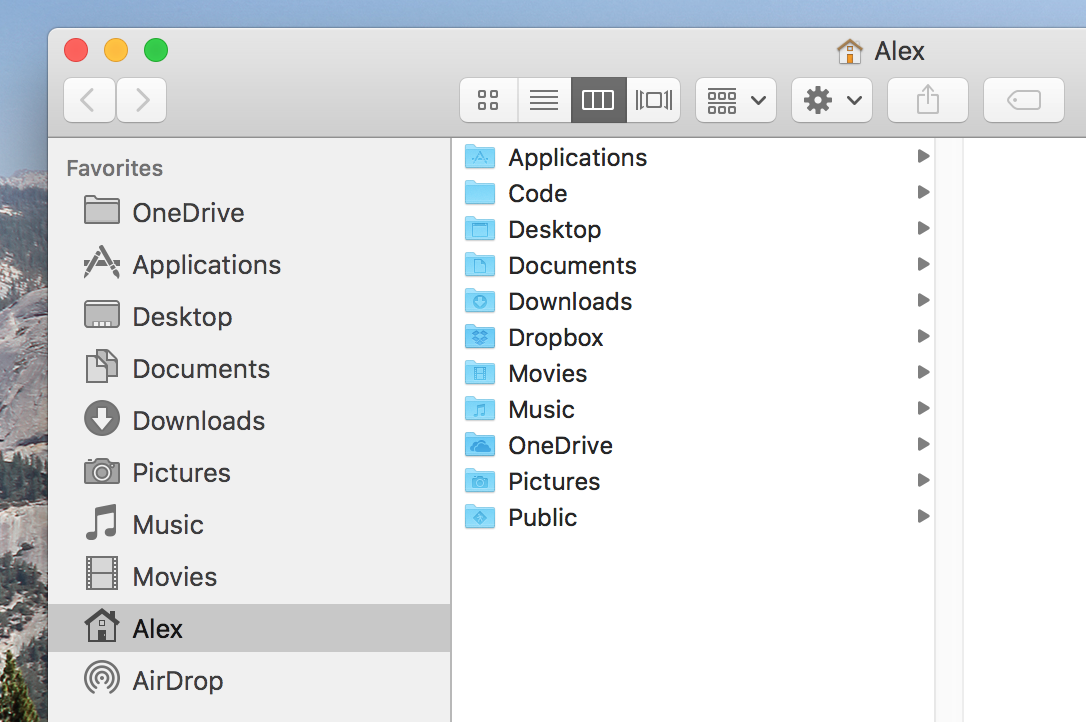
Spotlight's new tricks are neat. You can now use natural language queries like "emails from Jeff" to more easily find what you're looking for. It also has new Siri-esque features like delivering sports scores. It can't improve the Mariners' offense, but at least it's something. On the topic of Siri, I'm a little bit surprised that it was not added to OS X full-on, but I imagine it is somewhere down the pipeline. Maybe we'll have to wait for 10.12.
Now, for the main event: Performance and user interface transitions. I have excellent news, and that's that Apple has really improved things in El Capitan, and things could become even better before its final release this fall. It was stated in the keynote that apps now launch 1.4x faster, and that app switching is 2x faster than before. PDF loading in Preview is now 4x faster, and "deep architectural improvements" have been made to how the OS handles graphics. Core Animation now operates directly on top of Metal, Apple's graphics framework that was introduced on iOS last year. Rendering performance is claimed to be 50% faster, with a 40% reduction in CPU graphics utilization. This is big stuff!
The increase in graphical smoothness should be immediately noticeable to anyone with a Retina display. Taking windows in and out of fullscreen now has a different, faster animation. There is still more delay than I'd like in between clicking the button and seeing the animation, but it's an improvement. In terms of UI lag, this is one area that still stutters a bit. Elsewhere though, things have improved tremendously. Desktop switching now stutters less, and little things like opening a fan stack in the Dock seem a bit more spry and immediate.
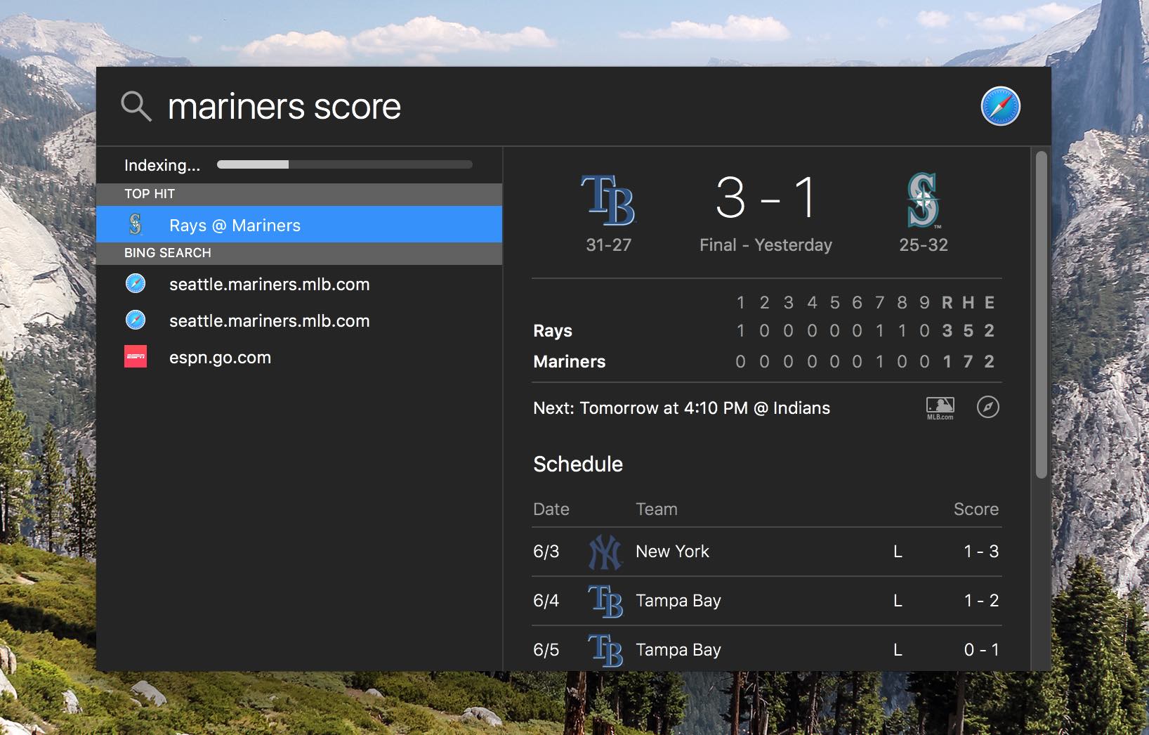
Mission Control is the most important UI transition in OS X, and it was most in need of improvement. It seems far more robust in El Capitan. In Yosemite, it really began to slow down when more than two or three windows were open, and it would seriously chug if video was playing. Now, in El Capitan, there are still a few stutters and frame drops, but performance stays near identical with more windows, even when HD video is playing! Curiously, the window labels and window gathering that was introduced in OS X Lion have disappeared, returning to more of an Exposé-style layout than what we now know to be Mission Control. It's actually a pretty disorienting removal. I'm hoping that it returns in a later beta, but not if it comes at the cost of this newfound performance.
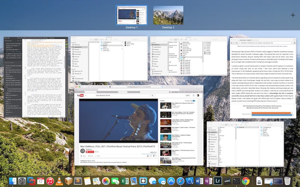
Viewing super high resolution PDFs in Preview really chugged in Yosemite, sometimes causing a beachball for several seconds in between pages. This seemed like more of a bug than a true performance limitation, because viewing PDFs with Quick Look was far faster, even when pinching to zoom in and out. Preview's performance is noticeably better. Scrolling is still choppy, but it no longer halts completely when moving from one page to another.
I worked to gather concrete benchmarks to compare Yosemite and El Capitan's UI transitions. It’s worth noting that since my last article, I (and many users) have detected a small improvement in the MacBook's graphical performance when running the OS X 10.10.4 beta. This is reflected in my measurements, which show a slight increase from what I found last time.
I did some benchmarks on Yosemite before upgrading, and even prepared a pretty graph to go along with them. Very frustratingly, though, the tool that I was using currently crashes on El Capitan, seemingly because there's a dependency that has been renamed, rewritten, or removed in this new version of OS X. So for now, I'm going to use estimated figures based on what I can visibly detect, and what I described above. Knowing that desktop switching already got very close to 60FPS, and noticing fewer stutters in El Capitan, I used that as a visual benchmark of what roughly 60FPS looked like and went from there. I acknowledge that this is completey unscientific and you should feel free to take these numbers with a grain of salt. If/when Quartz Debug is fixed, I will update the graph with official data from El Capitan. (And as always, if anyone can point me to a working FPS measuring tool, I'd love to use it.) I tested both builds with the "Reduced transparency" setting turned on, because it led to less variability in smoothness; sometimes, on El Capitan with transparency on full, eight windows in Mission Control would actually stutter less than four windows. I think this is an optimization that will be improved in future betas.
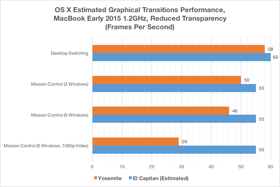
The above graph demonstrates the gist of what I noticed: desktop switching is effectively perfect now, Mission Control has improved across the board, and most notably, its performance with a lot of activity is very strong.
Other new features in El Capitan are more straightforward. The new supercharged Notes application is great for me, as I actually use it very regularly to keep track of random lists and ideas. Safari tab pinning is long overdue, but I wonder why favicons aren't just displayed on all tabs, instead of just on pinned ones. There's now an option to automatically hide and show the menu bar just like the Dock. Split View is elegant. Its implementation of "pick your second window" is almost comically similar to what Windows 10 does, but it's a great way to do it. Having to click and hold the green maximization button is not as intuitive as Windows' more immediate click-and-drag mechanism. Also, snapped windows do not just resize in the current desktop, but rather create a new space together, where the two windows act as a shared fullscreen app, rather than two apps on a desktop. This is a disorienting change, but it makes plenty of theoretical sense, so I'll give myself some time to adjust.
But the story here is performance. Performance, from graphical transitions to application launching, is simply better now. This is the "tock" of Apple's "tick-tock" OS X release schedule, but for me, it's far more satisfying than Yosemite's added visual chrome was. With this preview of OS X, I think I can say that the MacBook Performance Saga is finally over. Whether it's Windows 10 or OS X El Capitan, this computer really does have the chops to perform.
You might not be able to put your finger on a single new feature about OS X El Capitan that you love, but you'll enjoy using your Mac a lot more, and that's worth everything.